THE BEST NEUTRAL PAINT COLORS FOR YOUR SPACE (and how to pick a color palette)
Are you feeling overwhelmed by all the paint colors available? I’m so excited to be sharing this great news! Sherwin Williams announced The Living Well™ Collection, it is an inspired mix of colors and paints carefully chosen to invite a sense of comfort, style, and wellbeing into your home. In this blog, I’ll be sharing My Top 6 Color Palettes from the Living Well Collection and 4 Tips on How to Pick a Color Palette for Your Home. Paint is the most inexpensive impactful tool that you can use to help your home feel more comfortable and beautiful. During these uncertain times, it is no secret that we can all benefit from incorporating these tranquil colors into our built environment to support wellbeing. Whether you're looking for something subtle that will blend into your existing decor or something bolder to make a statement, we've got you covered with our roundup of the best neutral paint colors for any space. Not only are these timeless hues ideal for creating a calming oasis in your home, but they also provide endless possibilities when it comes to styling and accessorizing!
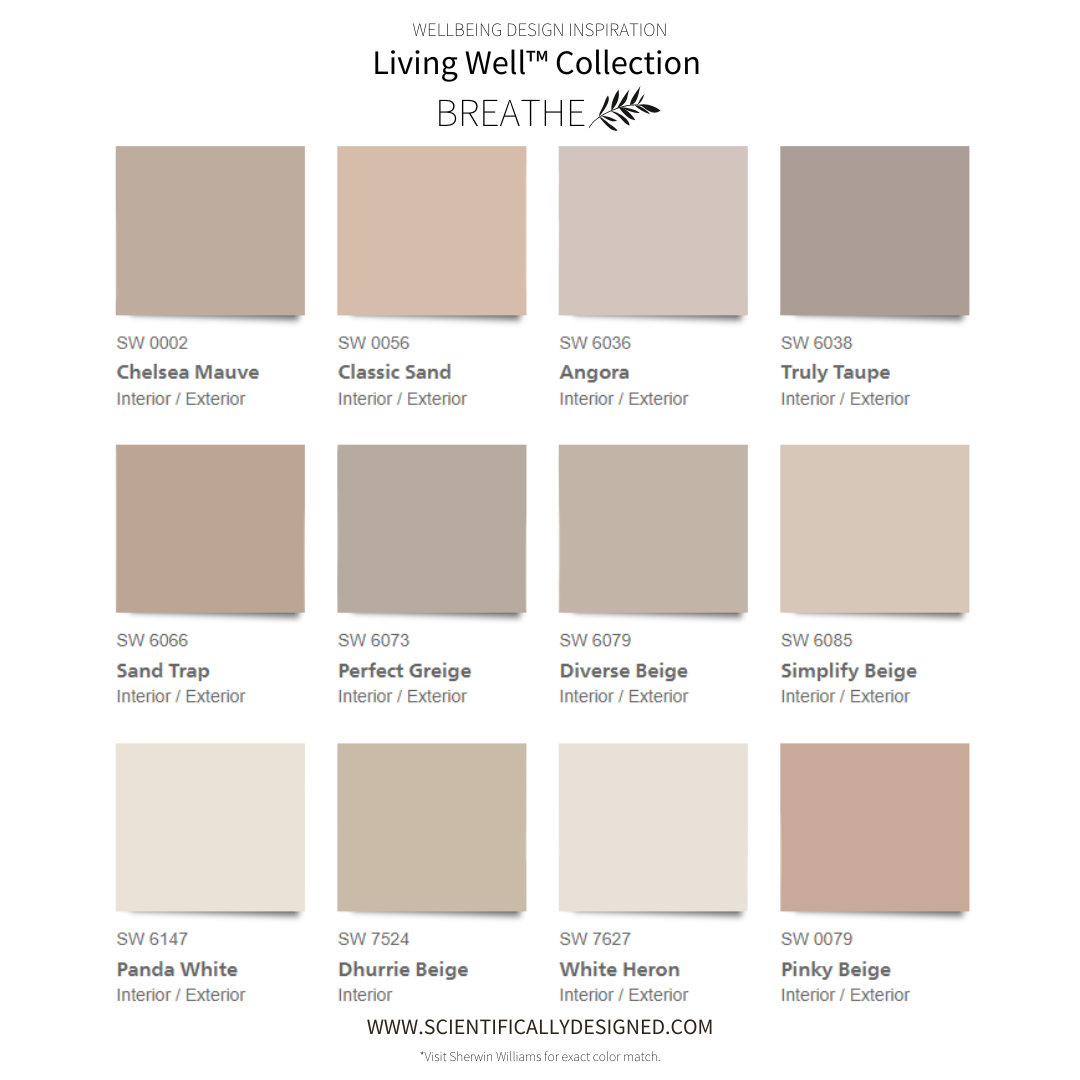
BREATH color palette below:
Honor the purity and power of being with gentle taupes and hints of warm sand. Take a breath. Exhale. Find ease. Grounded, warm neutrals suggest a subtle sophistication and encourage a deeply restorative kind of stillness.
SW 6036 Angora | SW 6038 Truly Taupe | SW 6079 Diverse Beige | SW 7627 White Heron | SW 0056 Classic Sand | SW 0079 Pinky Beige | SW 6066 Sand Trap | SW 6073 Perfect Greige | SW 6147 Panda White | SW 6085 Simplify Beige | SW 7524 Dhurrie Beige | SW 0002 Chelsea Mauve
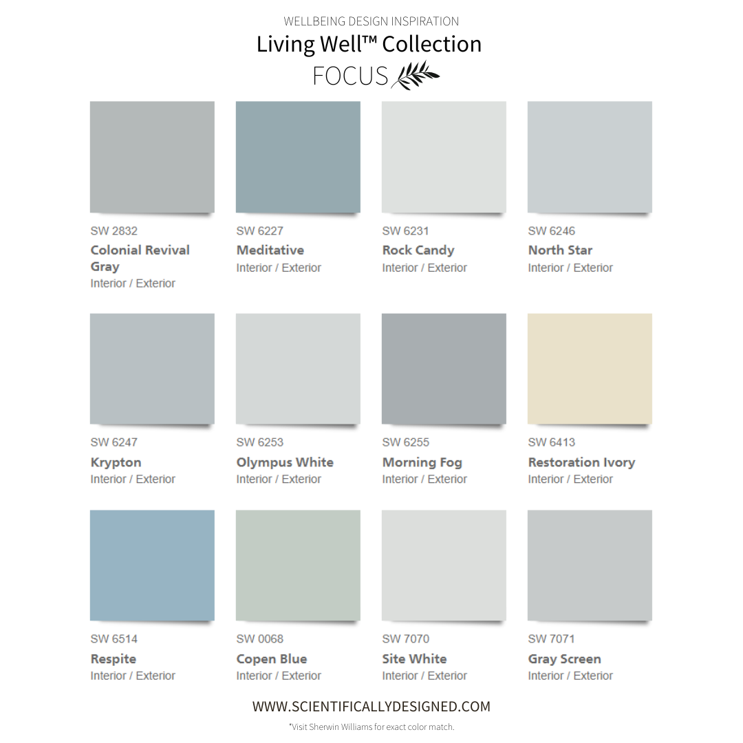
FOCUS color palette below:
Cool greys and clear-eyed marine hues inspire spaces where dreams become reality. Calm and collected colors build a backdrop for achieving big things, encouraging steadiness, drive, and careful concentration.
SW 7070 Site White | SW 6246 North Star | SW 6514 Respite | SW 6255 Morning Fog | SW 6253 Olympus White | SW 6239 Upward | SW 6231 Rock Candy | SW 6247 Krypton | SW 0068 Copen Blue | SW 2832 Colonial Revival Gray | SW 7071 Gray Screen | SW 6227 Meditative
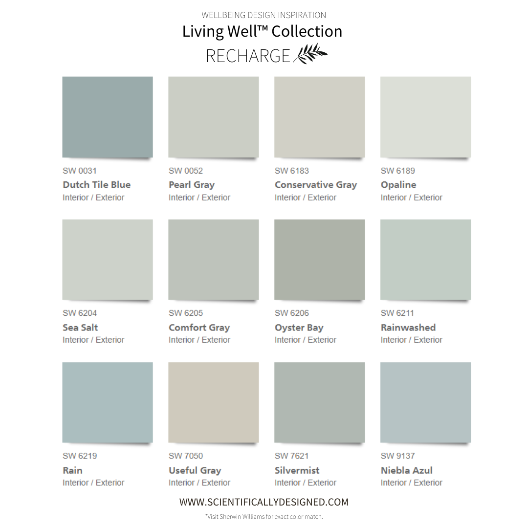
RECHARGE color palette below:
Submerge the senses in captivating coastal colors and fill the mind with a sense of calm and optimism. Reminiscent of salty sea breezes and crystal-clear waters, these cool blue hues bring to mind restful retreats, peaceful pools, and total relaxation.
SW 6211 Rainwashed | SW 6189 Opaline | SW 7050 Useful Gray | SW 6219 Rain | SW 6206 Oyster Bay | SW 0052 Pearl Gray | SW 6204 Sea Salt | SW 6183 Conservative Gray | SW 0031 Dutch Tile Blue | SW 9137 Niebla Azul | SW 6205 Comfort Gray | SW 7621 Silvermist

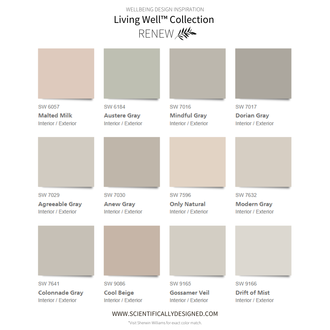
RENEW color palette below:
Settle in, quiet the mind, and find renewal in the softest, most soothing warm greys. This relaxed palette of warm greys is a reminder to revel in new beginnings, like the quiet calm of early dawn as a new day begins.
SW 9166 Drift of Mist | SW 7016 Mindful Gray | SW 6057 Malted Milk | SW 7017 Dorian Gray | SW 7029 Agreeable Gray | SW 7596 Only Natural | SW 7632 Modern Gray | SW 7641 Colonnade Gray | SW 6184 Austere Gray | SW 7030 Anew Gray | SW 9165 Gossamer Veil | SW 9086 Cool Beige

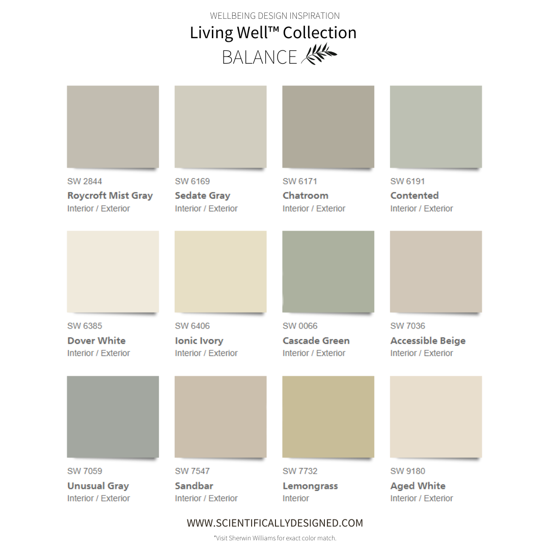
BALANCE color palette below:
Find room to flourish with woodland-inspired greens that evoke the simple tranquility of a lush forest. An abundance of organic shades, mimicking dappled sunlight and shadow, layer softness and texture into a sanctuary of your very own.
SW 6385 Dover White | SW 7732 Lemongrass | SW 6406 Ionic Ivory | SW 7036 Accessible Beige | SW 6171 Chatroom | SW 0066 Cascade Green | SW 7059 Unusual Gray | SW 2844 Roycroft Mist Gray | SW 6191 Contented | SW 7547 Sandbar | SW 6169 Sedate Gray | SW 9180 Aged White
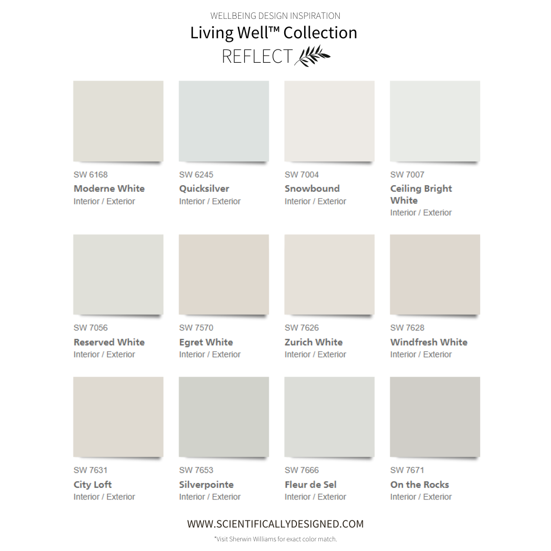
REFLECT color palette below:
Express your truest self with an airy, effortless collection of wondrous whites. An ethereal blend of crisp whites and soft gauzy greys adds a timeless touch that invites openness, contemplation, and inner peace.
SW 7631 City Loft | SW 7626 Zurich White | SW 7628 Windfresh Whites | SW 7653 Silverpointe | SW 7007 Ceiling Bright White | SW 6245 Quicksilver | SW 7570 Egret White | SW 7004 Snowbound | SW 7056 Reserved White | SW 7671 On the Rocks | SW 7666 Fleur de Sel | SW 6168 Moderne White

Want to Pick a Color Palette? Start with These 4 Tips.

#1. Inspiration Starts with You.
Step back and reflect on the core colors that make up your home. Inspect wall paint, floor coverings, ceilings, and cabinets to create a 3-5 color palette guide for further decorating inspiration. Compare each of these hues against large furniture pieces you plan to include in your design - take note of how you feel about the combinations; it's all part of an exciting journey towards creating a warm inviting living space that you love. Try out Sherwin Williams’ 8 x 8 Peel & Stick Wall Color Paint Samples – they let you compare different palettes against existing elements so you can make an informed decision about what will look great during both day and nighttime lighting conditions. If you are designing from a clean slate, be sure to check out my blog to help you determine the right color for your space - 3 Ways the Right (or Wrong) Color Impacts Your Space.
#2. Consider Lighting
When it comes to lighting, you have a range of options from which to choose. From warm incandescent or halogen bulbs with lower wattage at the low end (1900k), up to bright daylight LEDs that produce tones of blue and white light on the high end (7500k). For staging homes, we typically recommend 60-watt bulbs in the 2700K range but ultimately your choice will depend on personal preference. Whatever bulb type and color temperature selected, be sure that wall paint colors are taken into account as they can be affected by different types of lighting; for example, yellow hues become more pronounced under warmer lights while blues may stand out when using higher temperatures such as those offered by LED's producing Daylight illumination.
#3. Follow the 60/30/10 Rule:
Bring life to your space with the 60/30/10 Rule! Take a neutral palette as the foundation for creating a mood in any room - 60%. Then bring some style and personality into play by utilizing 30% of your color palette on items like sofas or curtains - but select ones that will look beautiful for years no matter how often you change up décor accents. Finally, let out your creative side when it comes time to add those finishing touches – use 10% of colorful/textured pillows, artwork, rugs, and more to make even small spaces feel full of character and charm.
#4. Always Consider Transitions
Understanding how to transition from one area of a room to the next is incredibly important when it comes to creating an aesthetically-pleasing interior. An effective way to do this is by paying attention to color flow. Expansive walls, like hallways or connected rooms, should be painted in neutral hues such as white, cream, and gray so that they can be smoothly connected without overbearing one space or another. Making sure transition walls have neutral paint colors, will provide a seamless transition and make the transition between different spaces feel intentional and purposeful.
Color is more than just aesthetics - it has an incredible power to affect your space, from inspiring energy and conversations to creating calming relaxation. Make sure every hue in your home supports the lifestyle you aspire for; be mindful of what colors will evoke which atmosphere so that ultimately, you can create a beautiful environment perfect for wellbeing!
XOXO ~ Martha


Looking to add a touch of color to your home but not sure what palette best fits the space? I'm here for you - let's make it happen! Together, we can explore different hues and create an inviting atmosphere that pays homage to one or several beautiful colors.