One Room Challenge: Week One - Paint
WEEK 1 (YOU ARE HERE) | WEEK 2 | WEEK 3 | WEEK 4 | WEEK 5 | WEEK 6 | WEEK 7 | WEEK 8
After weeks of going back and forward about entering the Fall 2022 One Room Challenge or Spring 2023, I finally decided the time is now! It’s been over a year and a half since our oldest moved out and he’s now engaged, so I think it’s safe to say he’s not coming back anytime soon.
Life can often be overwhelming, and we needed a place to take care of ourselves amidst the chaos. A spare bedroom could become your tranquil oasis - the perfect spot for self-care that allows you to escape from work or school stresses, technology overloads, and any other distractions life throws at us! Get ready to take your relaxation and restoration time up a notch! We are designing an immersive space that encourages reading, meditation, yoga, and even naps - no matter what level of spiritual connection you have. It's the ultimate in peace of mind as we create this intentional zone for recharging & refocusing our energy.
However, when creating your meditation space, choosing the correct paint colors are essential. The wrong shade can throw off the whole vibe and create an atmosphere that's anything but calming - while picking a tranquil tone will help make it a place where relaxation comes naturally.
So...we had a bright gold spare bedroom and decided to paint and transform it into a wellness space that could benefit the entire family.
BEFORE:

Week 1: Paint + Geometric Paneled Wall
If you want to create an inviting space without any distractions, then neutral tones are the way to go! Shades like cream, beige, taupe, grey, or white are all great options that won’t overwhelm the senses. The neutral colors help to focus attention on the furnishings while providing a comfortable backdrop that any furnishing can intertwine with. A neutral color palette is also practical because it is timeless and easy to update when décor needs to be refreshed. You may even want to try painting one wall in an accent color like we did while keeping the others neutral. This will keep things interesting while still keeping it peaceful and calming!
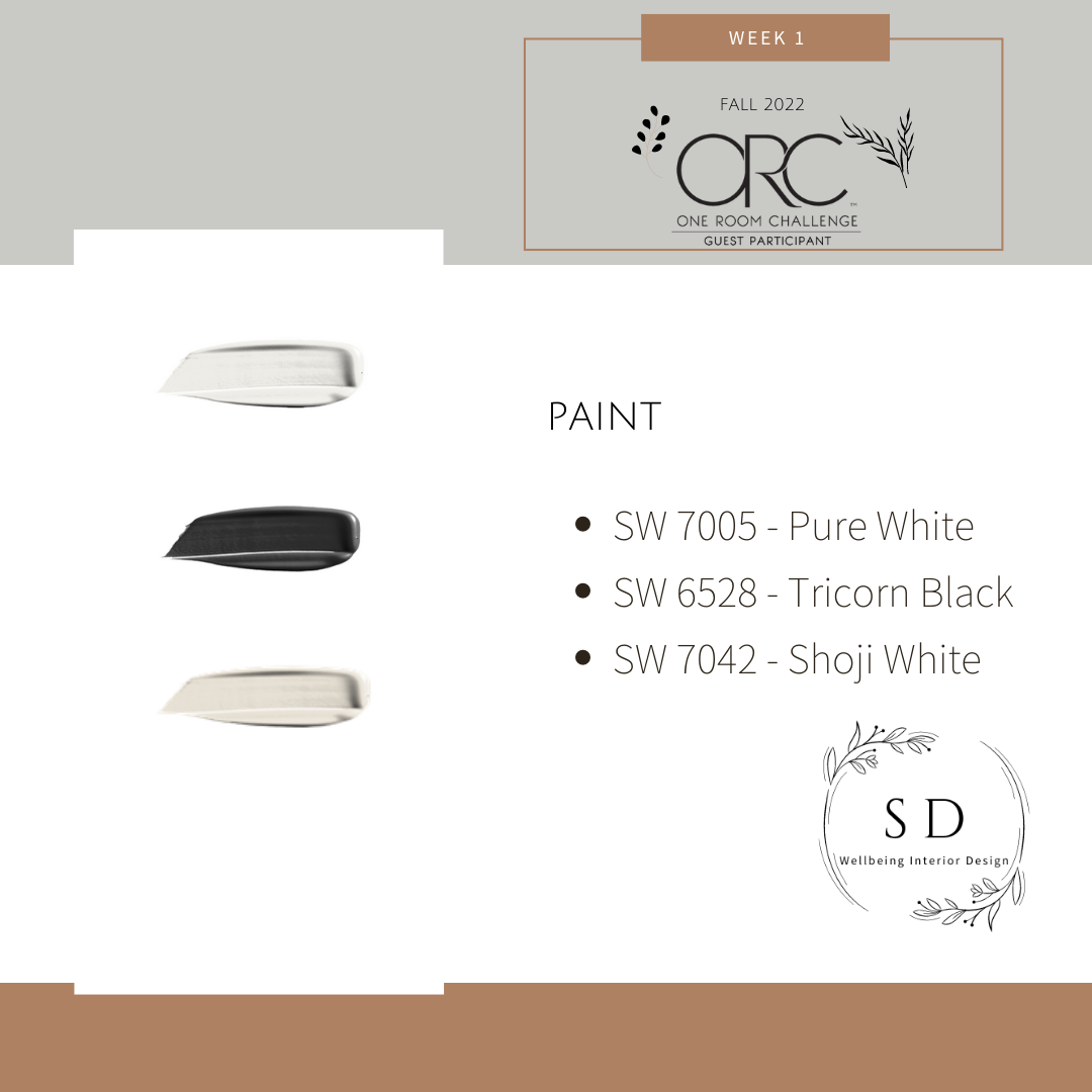
We went with the dramatic Tricorn Black SW6528 to provide balance to the space, Shoji White SW7042 to add warmth, and Pure White SW7005 to make our space feel crisp. If neutrals aren’t quite your style, go with a soft soothing color like light blue, it is often associated with peace, trust, and calmness which makes it perfect for a relaxing retreat. For more ideas on picking soothing paint colors check out my blog: THE BEST NEUTRAL PAINT COLORS FOR YOUR SPACE (AND HOW TO PICK A COLOR PALETTE).
As you can see we had our work cut out for us because the previous paint color was a bold yellow. It’s actually a beautiful paint color called Golden Coast SW6376 by Sherwin Williams; a beautiful name with a rich history. I chose to paint over it with Shoji White in the Sherwin Williams Emerald collection in a satin finish. The Emerald paint is a premium paint that offers exceptional washability and coverage with a formula that hides dark colors, resists water streaking, and helps prevent stains from penetrating. Also, the paint and primer in one contain anti-microbial agents* that inhibit the growth of mold and mildew on the paint surface and transform walls with a beautiful finish that speaks for itself.
To ensure my whitewash stayed white, I added an extra primer to my project. It gave me peace of mind and kept any orange tints at bay! If you'd prefer fewer steps in your paint job, this one can totally be skipped.

Next, we decided on a geometric wall panel design! Oh my with the squares, we measured, measured, and measured some more. 20 - 22Lx25W” squares later we made a trip to Home Depot.
Accent Wall Supplies:
2.5” wood paneling
Dap Painter’s Putty
Ridgid Brad Nail Gun
2” (18 gauge) Galvanized Brad Nails
Dap Trim Sealant
Paint Supplies:
Scotch Blue Painter’s Tape
Sherwin Williams Multi-Purpose Latex Primer
Sherwin Williams Emerald Paint (Satin Finish) Shoji White / Tricorn Black / Pure White
1” / 3” Purdy Paint Brushes
9” Purdy Marathon Paint Roller
Plastic Paint Tray
Next, we sealed and caulked around the wood paneling to create a seamless look.
SN: Remember to choose your paint finish wisely because paint shows all imperfections. We chose a satin finish but if you are looking to hide the imperfections (yes, they happen to us all!) use a flat finish instead of a paint with a sheen.

AFTER:

Black is a powerful color in any room, especially when it's used right. It provides an atmosphere of grounding and elegance that relaxes us while giving off a sense of mystery and sophistication. I can feel the color psychology at work with this black geometric paneled wall - every time I pass by, my eyes have nowhere else to go! Just remember: too much black could turn your space into something oppressive or depressing – so find a balance between drama and comfort for optimal results.
*Stay tuned as we continue this exciting journey into WEEK 2, we’ll be covering Lighting!
~ XOXO Martha